Sketchbook
Case studies of concept work that, although presented, did not progress further.
Samsung Beijing Winter Olympics
A series of billboard concepts for Samsung, a sponsor of the Olympic Games, which celebrates the many iconic architecturally designed buildings in Beijing. Samsung products are overlaid on to the buildings in the background, with images on the screens that reference the different Winter Olympic sports, matching the shapes of the snow and ice-covered sporting arenas with the shapes of the buildings behind. This work followed the Samsung guidelines colour palette and illustration style.
Concept design, illustration.


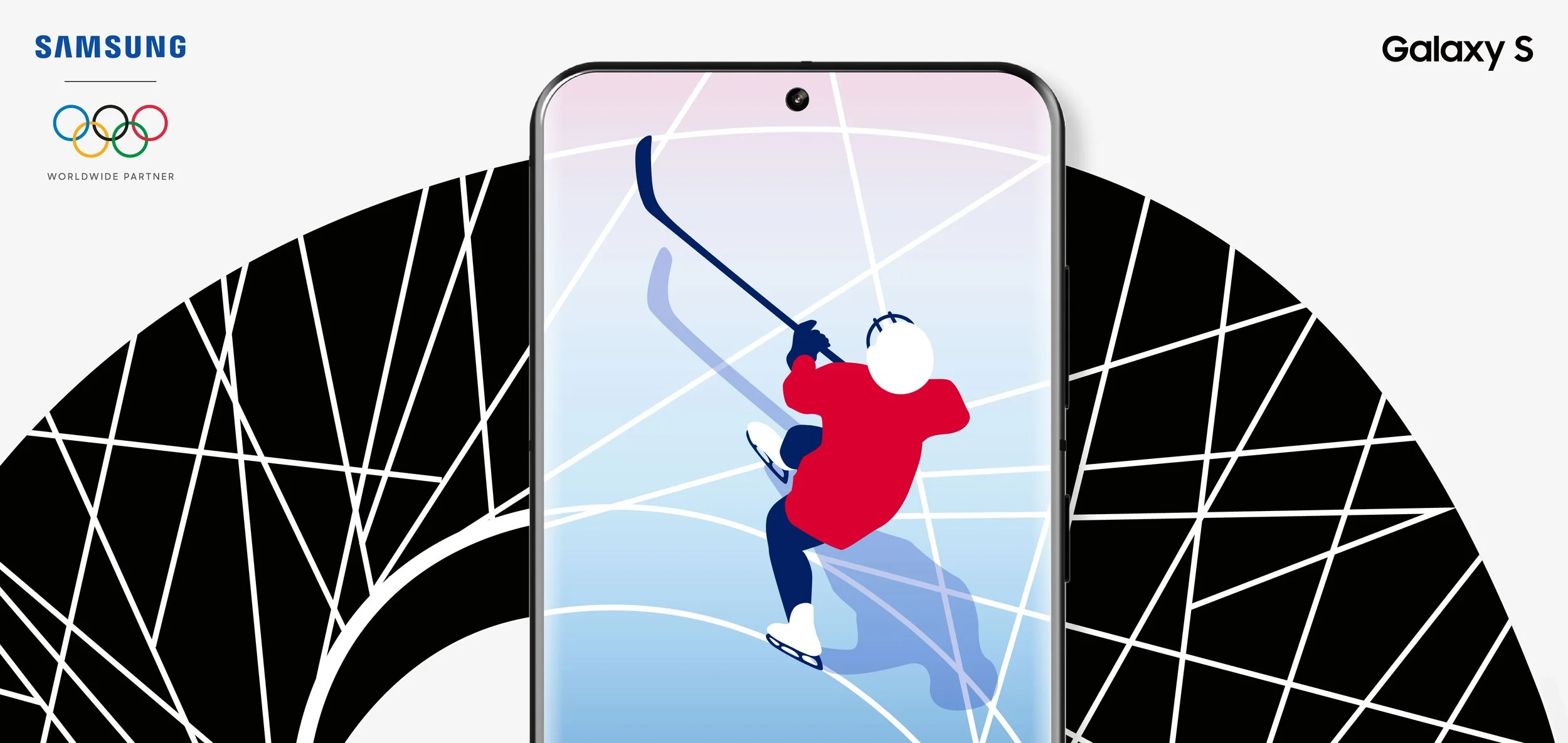


Below, the Galaxy SOHO building designed by Zaha Hadid paired with the bobsleigh event, and freestyle skiing paired with the Temple of Heaven, both on a Galaxy S screen.


The National Speed Skating Oval in Beijing is overlaid with skaters on the screen of the Galaxy Tab S7 with the Galaxy earbuds sitting on it as helmets, below.


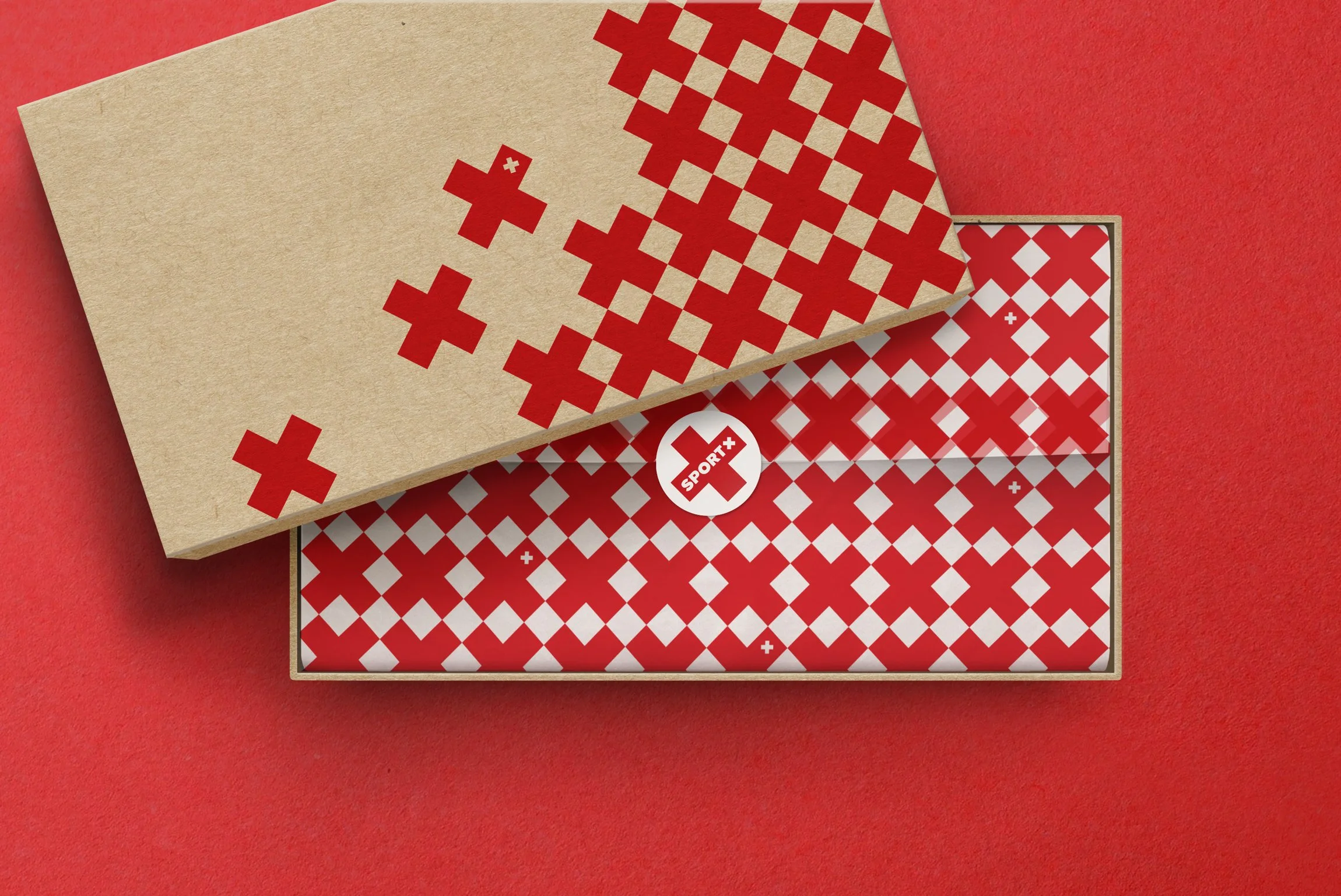
SportX
SportX is the outdoor and fitness branch of Migros, Switzerland’s largest retail company. They wanted to update their existing visual identity with something that felt more modern and worked with their new positioning of holistic wellness for both body and mind.
Logo and visual identity concept design and execution, copy.

This design was one of three presented. It draws upon the fact that the SportX positioning is reflected in Switzerland itself, which is famous for its quality of life and wellbeing, by incorporating the cross from the Swiss flag into the logo.
Bold, geometric type with consistent angles echoing those of the X conveys confidence and dynamism and further supports the reference to the Swiss flag. In addition to the primary logo above, the X takes centre stage as a bold, more square expression of the logo and as a simplified shorthand mark.


The bold shape and angles of the x work at both small and large scale and inspire pattern, holding shapes and focus in communications, creating a striking, cohesive visual identity.


The chosen design below was considered, of the three options shown to the client, to best represent the idea of strength and overall wellness in a modern way. The colours and double x of the previous logo design were felt to have a negative connotation, one of the reasons for the update.

Chosen logo (not my design)
Previous logo
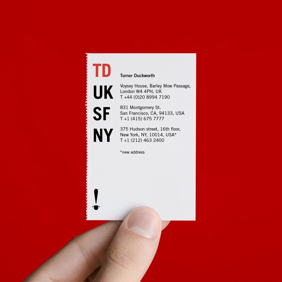
Turner Duckworth holiday card
A concept for a holiday card for clients from the company’s two existing offices which also announces the recent opening of the new office in New York. The card is perforated, allowing the address details to be detached and used as a business card. The design uses the company “eyesclamation” logo and follows the company’s type style.
Concept design, copy.